
.png)
The assessment considers the whole user journey for ‘citizens’ users, from the moment of downloading the app until send alert. The objective is to understand what would be the easier path for citizens to send alerts in an emergency situation.
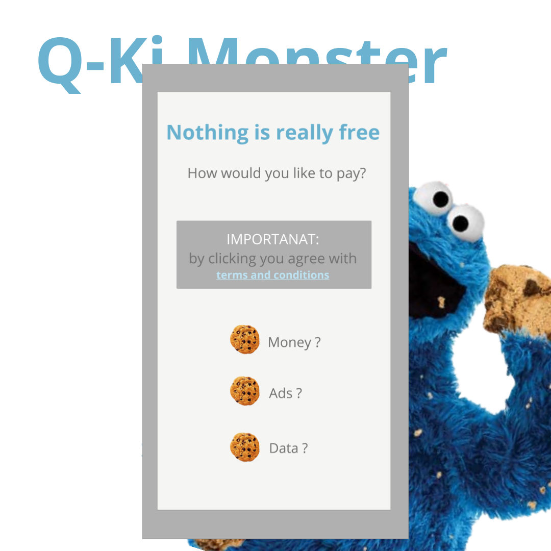
This diagnosis also provides an overview of UX UI design good practices. Beyond offering single solutions, the report offers the rationality for creating types of solutions that can improve the overall user experience.
.png)
.png)
.png)
.png)
The app H.A.R.D enables governments to follow which areas of the city reported similar alerts, and take measures to prevent risk and disaster. Yet, for this to happen the quality of alerts should improve, to consolidate an efficient database. That is why for this instance the company wanted to focus in the citizen user journey. The journey we proposed was contemplating a COVID-19 alert, thought the journey of Carla (our user persona). In Carla´s case as well as in a case of a real emergency alert, which are the minimum relevant fields to complete, considering that a stressed person is not able to fill a complete form detailing accurately the status in the middle of the emergency. Considering these aspects, we proposed a series of improvements for the next iteration of the app, and further developments of the project


.png)
.png)